Making Data Useful
22 Oct 2023 (first version 31 Aug 2021)
#Preliminaries:
knitr::opts_chunk$set( message=FALSE, warning=FALSE) #echo = FALSE,

rm(list=ls())
library(readxl)
library(tidyverse)
library(viridis)
Introduction
In our rapidly evolving digital age, Mark Twain’s famous quip, “I only believe in statistics that I doctored myself”, takes on new significance. As the amount and accessibility of data continue to expand, the challenge of transforming raw data into actionable insights becomes increasingly vital. This informational revolution is equally relevant to business decisions, policy making, and empowering people to navigate an information-saturated world. The good news is that we can now make more evidence-based decisions, thanks to the decreasing barriers of data availability (e.g. this blog post or ICPSR), advancements in software and hardware, and the democratization of data analysis tools supported by the open source movement. However, the challenge remains: How do we separate valuable insights from the noise? The answer lies, in part, in fostering data literacy, transparency and reliable data science workflows.
Data Exploration
Let’s take the first step together by demonstrating how you can turn data into valuable insights using just a few lines of R code, to uncover intriguing patterns in global happiness. We’ll use data from the World Happiness Report 2023, which compiles self-reported happiness data from various countries. We first download and read the data
if (file.exists("DataForTable2.1WHR2023.xls")) {

  data_in <- readxl::read_excel("DataForTable2.1WHR2023.xls")

} else {

  download.file("https://happiness-report.s3.amazonaws.com/2023/DataForTable2.1WHR2023.xls", "DataForTable2.1WHR2023.xls", mode = 'wb') #adjust 'mode' if not running on windows machine

  data_in <- read_excel("DataForTable2.1WHR2023.xls")

}

#show data:
head(data_in)
and with the aid of the popular R-tidyverse framework, we’ll manipulate the data to explore regional and developmental trends in average perceived happiness across the globe. Our analysis focuses on information from year 2010 onward and we order the 163 countries by their “happiness index”, averaged over time. For data visualization we use the library ggplot2.
# prepare data:
data_plot <- data_in %>%
  filter(year >= 2010) %>%
  group_by(`Country name`) %>%
  mutate(happiness_mean=mean(`Life Ladder`), n=n()) %>% #mean happiness by country
  ungroup() %>%
  mutate(rank=rank(happiness_mean))  %>% #create happiness rank across countries
  mutate(year=as.factor(year), `Country name`=fct_reorder(factor(`Country name`), rank)) #order countries by average happiness

# create plot:
data_plot %>%
  ggplot(aes(y=`Country name`, x=year,  fill=`Life Ladder`)) + # graph
  scale_fill_viridis(option="inferno") + #colour
  geom_tile(colour="white") +            #background colors
  theme_minimal(base_size = 7) +
  theme(axis.text.x = element_text(angle = 45, hjust=1)) +
  labs(title="Hierarchy and Development of Happiness", fill="Happiness Score",
y="Country", x="Year") 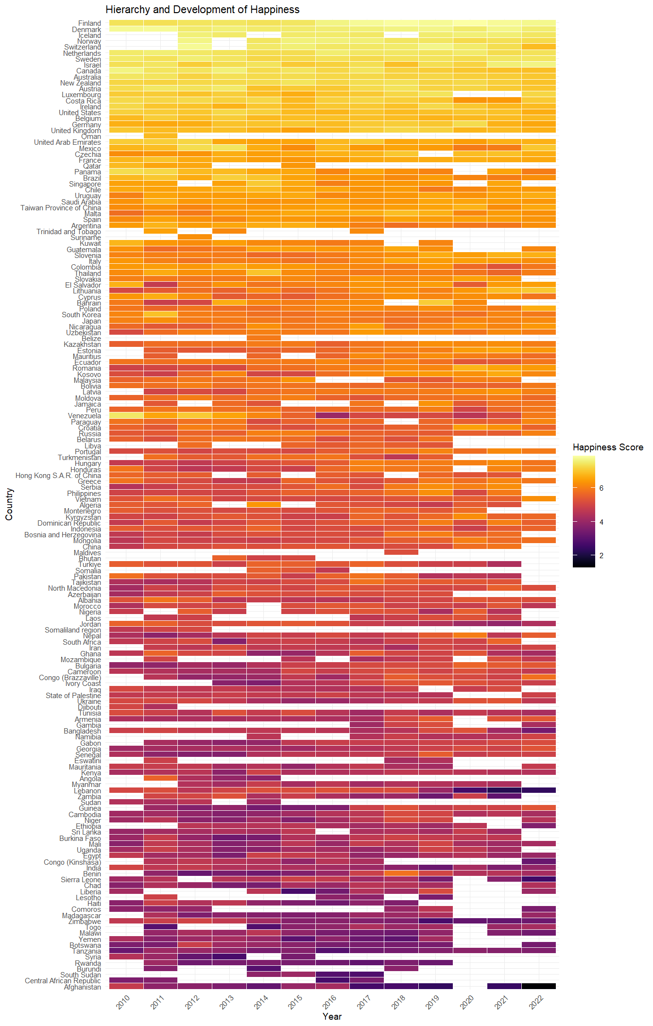
The resulting heatmap, inspired by Healy (2018), is showing the world’s happiness across countries and over time. Nordic countries consistently rank high, while many African and Oriental countries trend toward the bottom. We also see that from 2020 there are more white spaces across the world. Is this phenomenon linked to the COVID-19 pandemic? Examining differences, changes, extreme values, and missing values can be a rich source of insights when exploring a data set.
Data Science in Action
The data journey doesn’t stop at mere observation: Knowledge of programming, modeling, and statistical communication provides us with a range of skills from data wrangling and visualization to predicting outcomes for new instances (eg. Kuhn and Johnson (2013)), and assessing causal relationships (eg. Pearl and Mackenzie (2018)). These empower us to enhance business decision-making, create new data-based products, tell stories with data, and much more.
In the spirit of this discussion, this website gives some examples of reproducible data analytics using various real-world data, which may be interesting to you, whether you are new to data science or a seasoned professional. Your input helps to improve the content. Explore the case studies on this webpage, and share your feedback via email, or connect with me on LinkedIn.